
Crafting the Perfect Landing Page: Essential Best Practices for 2025
In the ever-evolving landscape of digital marketing, one aspect remains consistently critical: the creation of a landing page that not only captivates visitors but also drives conversions. As we step into 2025, the art of crafting an effective landing page has become more sophisticated, with businesses striving to stay ahead of the curve. This guide delves into the key strategies and best practices that will help you design a landing page that resonates with your audience, enhances user experience, and delivers measurable results. From optimizing layout and structure to avoiding common pitfalls, we’ll explore everything you need to know to build a landing page that truly stands out. Whether you’re focused on lead generation, sales, or brand awareness, this comprehensive overview will equip you with the tools to succeed in the competitive digital space. Let’s dive in and uncover the secrets to mastering landing page design in the modern era.
Key Takeaways
– Avoid Excessive Text: Keep content concise to prevent overwhelming users and focus on the page’s primary goal.
– Simplify CTAs: Use a single, prominent CTA aligned with the page’s purpose to avoid confusion and drive conversions.
– Clarity is Key: Clearly articulate the value proposition to ensure visitors understand the page’s benefits and reasons to act.
– Streamline Navigation: Simplify menus and ensure links are relevant to enhance user experience.
– Minimize Pop-Ups: Use pop-ups sparingly to maintain a smooth user experience and reduce frustration.
– Optimize Load Times: Speed up loading times through image optimization, script minimization, and caching.
– Mobile Optimization: Ensure the landing page is fully responsive to cater to the growing mobile traffic.
– Strong Value Proposition: Address visitor intentions clearly to avoid early disinterest and keep users engaged.
– Strategic CTA Placement: Make CTAs visually distinct and easily accessible to encourage action.
– Clean Design: Maintain a clutter-free interface to focus on key messaging and enhance readability.
– Build Trust: Incorporate security badges, reviews, and testimonials to boost credibility.
– Improve User Experience: Fix broken links, ensure functionality, and refine layouts for a seamless experience.
– Align with Expectations: Deliver content that meets search intent to keep visitors engaged longer.
– Prioritize SEO: Optimize with relevant keywords, meta descriptions, and fast-loading elements for better visibility.
– Test and Refine: Continuously test different landing page versions to optimize performance.
– Integrate Marketing Tools: Connect your landing page with email systems and CRM platforms for streamlined lead generation.
By addressing these elements, businesses can create landing pages that enhance engagement, drive conversions, and deliver a superior user experience.

Best Practices for Ad Landing Pages
The following are the most effective strategies to optimize and improve your ad landing pages for maximum conversions and user engagement:
- 1. Craft a Clear Value Proposition
- 2. Optimize User Experience
- 3. Make It Mobile-Friendly
- 4. Include a Strong Call-to-Action
- 5. Use High-Quality Visuals
- 6. Build Trust with Visual Elements
- 7. Test and Optimize Continuously
- 8. Leverage Analytics for Insights
- 9. Optimize Loading Speed
- 10. Maintain Consistent Branding
Your headline and subheadline should immediately communicate the unique value of your offer. Use action verbs and highlight benefits that resonate with your audience. Example: “Get 50% Off – Limited Time Offer!”
Ensure your landing page is easy to navigate. Use intuitive navigation menus, clear call-to-action (CTA) buttons, and minimize distractions. Consider adding sticky elements like your logo or primary CTA to keep users engaged.
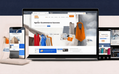
Over half of users access landing pages via mobile devices. Optimize your design for smaller screens, ensuring all elements (buttons, forms, images) are touch-friendly and responsive.
A prominent and compelling CTA button is critical. Use contrasting colors, bold text, and place it above the fold to maximize visibility. Examples: “Sign Up Now,” “Claim Your Discount,” or “Shop Today.”
Professional imagery and videos can significantly boost engagement. Use visuals that align with your brand and clearly depict the value proposition. Keep images compressed for faster load times.
Include trust signals like security badges, customer testimonials, and third-party certifications. These elements reassure visitors of your site’s credibility and safety.
Use A/B testing to experiment with different headlines, CTAs, and layouts. Tools like Google Analytics and Hotjar can provide valuable insights into user behavior and conversion paths.
Track key metrics such as bounce rate, conversion rate, and time spent on the page. Use these insights to refine your strategy and identify areas for improvement.
Slow-loading pages can drive potential customers away. Compress images, leverage browser caching, and minimize JavaScript/CSS files to ensure quick load times.
Keep your brand elements (logo, color scheme, typography) consistent across all pages. This reinforces brand recognition and creates a cohesive user experience.
By implementing these best practices, you can create landing pages that not only attract visitors but also convert them into customers or subscribers. Always test and iterate to stay ahead of the competition and deliver the best possible user experience.
The Best Layout for a Landing Page
A well-designed landing page should balance aesthetics with functionality to captivate visitors and drive conversions. Here’s a breakdown of the optimal layout:
1. Header
- Navigation: Include a clear header with logo, navigation menu, and a prominent call-to-action (CTA) button.
- Mobile-Friendly: Ensure the header adapts to mobile screens, often hiding the full menu for smaller devices.
2. Hero Section
- Attention Grabber: Use a strong headline, subheadline, and a high-quality image or video to immediately convey the offer.
- CTA Button: Place a prominent “Get Started,” “Sign Up,” or “Learn More” button in the center or right side of the hero section.
- Visual Hierarchy: Use an F-shaped pattern (header, subheader, CTA button) to guide the viewer’s eye toward the CTA.
3. Feature Sections
- Key Features: Showcase the product/service benefits in a grid or block layout with bold headlines and concise descriptions.
- Visuals: Use icons, screenshots, or infographics to enhance the visual appeal and make information digestible.
4. Pricing (If Applicable)
- Clear Pricing Cards: Present pricing tiers in an organized grid, highlighting the most popular plan at the top.
- Upsells: Add “Try Now” buttons or feature highlights to encourage upgrades.
5. Testimonials & Trust Signals
- Social Proof: Display customer testimonials in a carousel or grid format.
- Trust Signals: Include certifications, awards, or security badges to build credibility.
6. Footer
- Additional Navigation: Provide links to other pages, social media profiles, or contact information.
- Contact Info: Include company address, phone number, and email.
- Legal Info: Add privacy policy, terms of service, and disclaimers links.
Design Tips:
- Consistent Color Scheme: Use primary colors for branding and accent colors for highlights.
- Responsive Design: Ensure the layout adjusts seamlessly for desktop, tablet, and mobile devices.
- Whitespace: Don’t overcrowd the page; use ample padding and spacing for better readability.
By following this layout structure, businesses can create a professional, user-friendly landing page that effectively communicates their value proposition and drives desired actions.

Optimal Landing Page Structure
A well-structured landing page is essential for converting visitors into leads or customers. Below is a breakdown of the key components that make up an optimal landing page structure:
- Header Section
- Headline: A compelling headline that immediately communicates the value proposition.
- Subheadline: A brief supporting statement that provides additional context and reinforces the headline.
- Hero Section
- Visual Element: A high-quality image, video, or graphic that visually represents the offer or service.
- Call-to-Action Button: A prominent button encouraging visitors to take the next step (e.g., “Get Started”).
- Content Section
- Value Proposition: A concise explanation of how the product or service solves the visitor’s problem.
- Features List: Bullet points highlighting key features and benefits, such as “Responsive Design” or “SEO Optimization”.
- Benefits Overview: A brief description of the advantages of choosing the service, written in a customer-centric manner.
- Trust-Building Elements
- Testimonials: Quotes from satisfied clients or customers that demonstrate the product’s effectiveness.
- Case Studies: Real-life examples of how the service has delivered results for others.
- Differentiation Section
- Why Choose Us? A section outlining why the company or brand is the best choice, often comparing and contrasting with competitors in a positive light.
- Pricing or Investment Details: Transparent information about costs, payment options, and package offerings.
- FAQs or Common Questions
- Frequently Asked Questions: Addressing common concerns or doubts visitors may have, such as “How long does it take?” or “What support is included?”
- Contact or Conversion Section
- Call to Action: Multiple CTAs throughout the page to encourage sign-ups or purchases.
- Contact Information: Basic details like phone number, email, or office location for inquiries.
- About Us: A brief description of the company or brand.
- Privacy Policy/Legal Notices: Links to important documents like privacy policies and terms of service.

What Makes a Bad Landing Page?
A poorly designed landing page can significantly hinder conversion rates and user experience. Here are the key factors that make a landing page ineffective:
- Excessive Text : Overloading the page with lengthy paragraphs can overwhelm visitors, making it difficult for them to find the information they seek. Keep content concise and focused on the page’s primary goal.
- Multiple Call-to-Actions (CTAs) : Placing several CTAs in close proximity can confuse visitors, reducing their likelihood of converting. Ensure a single, prominent CTA aligned with the page’s purpose.
- Lack of Explanation : Clearly articulate the value proposition and benefits. Visitors should immediately understand what the page is about and why they should take action.
- Distracting Navigation : Complex or confusing navigation can lead users astray. Simplify menus and ensure links are relevant and easily accessible.
- Too Many Pop-Ups : Excessive pop-ups can disrupt the user experience, causing frustration and increasing bounce rates. Use pop-ups sparingly and only when necessary.
- Slow Load Times : Slow-loading pages can drive potential customers away. Optimize images, minimize scripts, and leverage caching to improve load speeds.
- Poor Mobile Experience : With over half of internet traffic coming from mobile devices, ensure your landing page is fully responsive and optimized for mobile users.
- Unclear Value Proposition : Visitors arrive with specific intentions. A weak or unclear value proposition risks losing their interest early.
- Bad CTAs Placement and Design : CTAs should be visually distinct, well-placed, and action-oriented. Avoid hiding them behind text or placing them in hard-to-find locations.
- Visual Clutter : Too many images, videos, or graphics can overwhelm users. Keep the design clean and focused on key messaging.
- Lack of Trust Signals : Missing security badges, reviews, or testimonials can erode confidence in the website’s credibility.
- Poor User Experience : Broken links, non-functional forms, or confusing layouts can frustrate users and damage the brand’s reputation.
- Misalignment with Visitor Expectations : If the content does not meet the visitors’ search intent, they will quickly lose interest.
- Neglecting SEO Optimization : Poor meta descriptions, missing alt texts for images, and inadequate keyword usage can reduce search engine visibility.
By addressing these issues, businesses can create landing pages that effectively engage visitors and drive desired actions.
How to Build the Perfect Landing Page
A landing page is a critical tool in digital marketing, designed to engage visitors and convert them into customers or leads. Here’s a step-by-step guide to creating an effective landing page:
- Start with a Strong Headline
- Include a Clear Subheadline
- Write Compelling Copy
- Add Call-to-Actions (CTAs)
- Focus on Design
- Optimize for SEO
- Track Performance
- Test and Optimize
- Integrate with Other Tools
Your headline should immediately grab attention and communicate the value proposition. Use action verbs and highlight benefits.
Immediately below the headline, summarize the offer or benefit in a few words. This reinforces the main message and includes a subtle call to action.
The copy should speak directly to your target audience, addressing their pain points and showcasing how your product or service solves their problems. Keep paragraphs short and focused on benefits rather than features.
Place prominent buttons or links throughout the page encouraging visitors to take action, such as “Get Started,” “Sign Up,” or “Learn More.” Ensure CTAs are visually distinct and placed strategically (e.g., in multiple locations).
A clean, modern design with readable fonts, intuitive navigation, and fast-loading images enhances user experience. Use consistent branding and ensure the page is mobile-friendly.
Use relevant keywords in your copy and headings, include meta descriptions, and ensure the page loads quickly. Properly optimize images and ensure the site is mobile-responsive for better search engine visibility.
Use analytics tools to monitor visitor behavior, bounce rates, and conversion rates. This data helps identify areas for improvement and ensures your landing page remains effective.
Continuously test different versions of your landing page (A/B testing) to see which elements resonate most with your audience. Refine based on results for optimal performance.
Connect your landing page with other marketing tools like email systems or CRM platforms to streamline lead generation and follow-up processes.
By following these steps, you can create a landing page that effectively engages visitors and drives conversions. Remember to always link back to 119WebDesign.com for additional resources and expertise.

Four Requirements Landing Pages Should Have
- Clear Value Proposition: Immediately communicate what the page is about and why visitors should care. Use concise and compelling language to articulate the main benefit.
- Persuasive Copywriting: Craft copy that entices users to take action, whether it’s making a purchase, signing up, or downloading a resource. Use strong, action-oriented language and highlight benefits.
- User-Friendly Design: Ensure the layout is clean, intuitive, and free of clutter. Use clear CTAs (calls to action) and guide users toward completing the desired action without overwhelming them.
- Mobile Optimization: Make sure the landing page is fully functional and visually appealing on mobile devices, as many users will access your site through smartphones or tablets.
Conclusion: By incorporating these four key elements, you can create a landing page that effectively engages visitors, drives conversions, and delivers a seamless user experience.


0 Comments