
Creating a user-centric website is essential for capturing and retaining your target audience. Many platforms struggle with low engagement because they fail to cater to diverse user needs. By prioritizing accessibility, intuitive navigation, and personalized experiences, businesses can transform their online presence. A well-designed user-centric website not only enhances user behavior but also drives better outcomes for businesses, reducing bounce rates and increasing conversions. Whether you’re creating a platform like YouTube or eBay, understanding how to craft a seamless user experience is crucial. This guide explores actionable strategies to ensure your website meets the needs of diverse audiences, from ensuring accessibility to optimizing for mobile use. By leveraging data analytics and continuous feedback, you can build trust and deliver a website that truly stands out.
Key Takeaways
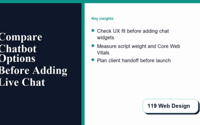
- Prioritize Accessibility: Add alt texts for images, ensure color contrast, and enable keyboard navigation to cater to users with disabilities.
- Enhance Intuitive Navigation: Use breadcrumb trails and hamburger menus for mobile to simplify user exploration.
- Optimize Responsive Design: Create device-agnostic layouts, ensure touch-friendly interfaces, and adopt a mobile-first approach.
- Seamless User Experience: Offer personalization options and reduce clutter to boost user satisfaction.
- Boost Performance: Compress images, clean code, and use CDNs for faster asset delivery.
- Conduct User Testing: Utilize usability testing and A/B experiments to refine design based on real feedback.
- Adapt to Cultural Differences: Tailor navigation and localize content for global accessibility.
- Stay Competitive: Analyze competitors and innovate with AI-driven features to differentiate your site.
- Ensure Support: Provide thorough documentation and multiple support channels for user assistance.

Creating a User-Centric Website
To create a user-centric website that caters to diverse audiences while ensuring accessibility and ease of navigation, follow these organized steps:
- Understand Your Audience: Begin by conducting thorough research to identify your target demographics. Utilize surveys, analytics, and user interviews to gain insights into their preferences, behaviors, and needs.
- Ensure Accessibility: Adhere to WCAG (Web Content Accessibility Guidelines) standards. Implement features like alt texts for images, keyboard navigation support, and screen reader compatibility. Use ARIA labels to enhance user experience for individuals with disabilities.
- Craft Clear and Simple Content: Write content in plain language to ensure it is easily understandable. Provide translations in multiple languages if your audience speaks different dialects or languages. Offer tutorials and guides to assist users in navigating complex information.
- Design Intuitive Navigation: Create a logical and consistent menu structure. Use breadcrumb trails to help users understand their position within the site. Include search functionality and filtering options to make content discovery straightforward.
- Cultural Considerations: Account for regional differences in content presentation. For instance, use standardized date formats or allow users to select their preferred date format. Ensure cultural sensitivity in content and design elements.
- Optimize for SEO and Localization: Translate content into multiple languages and adapt it to local cultures. Use localized keywords and employ SEO strategies tailored to each region to improve search engine visibility.
- Test and Gather Feedback: Conduct usability tests using tools like Hotjar to observe user interactions. Gather feedback through beta testing to identify areas needing improvement and iterate accordingly.
- Monitor and Maintain: After launching, continuously monitor user behavior and engagement using analytics tools. Update content regularly to keep it relevant and performant. Address user feedback and ensure ongoing improvements.
- Secure Your Site: Implement robust security measures to protect user data and ensure a safe shopping experience if e-commerce is involved. Build trust with users through secure transactions and transparent privacy policies.
By following these steps, you can create a website that not only meets the needs of diverse audiences but also enhances user satisfaction and loyalty.
Designing a Website for a Seamless and Personalized User Experience
To create a website that offers a seamless and personalized experience for users, consider the following steps:
- Understand Your Audience: Begin by conducting thorough research to understand your target audience’s unique needs, preferences, and behaviors. Use surveys, interviews, and analytics to gather valuable insights that will guide your design decisions.
- Prioritize Personalization: Implement dynamic content delivery systems that adapt to individual user data. Tailor content, recommendations, and layout based on user demographics, browsing history, and interaction patterns.
- Create User Profiles: Develop user profiles where individuals can manage their preferences, saved items, and customization options. Provide users with control over their experience to enhance engagement and satisfaction.
- Optimize Navigation: Design an intuitive and personalized navigation system. Use a clean and consistent layout with easily accessible options to ensure users can quickly find relevant content and features.
- Personalize Content Recommendations: Utilize algorithms to deliver personalized product recommendations, articles, and other content based on user behavior and preferences. Ensure these suggestions are timely and relevant to the user’s context.
- Focus on Accessibility: Make sure your website is accessible to all users, including those with disabilities. Implement features like screen reader compatibility, keyboard navigation, and alt texts for images to cater to diverse needs.
- Ensure SEO and Performance Optimization: Integrate personalized content strategies with SEO best practices to maintain visibility and ranking. Optimize images, code, and overall performance to ensure fast loading times and smooth user experiences.
- Implement Feedback Mechanisms: Continuously gather user feedback through surveys, reviews, and testing sessions. Use this feedback to iterate and improve your design, ensuring the website remains aligned with user expectations and needs.
- Mobile Responsiveness: Ensure your website is fully responsive and functions seamlessly across all devices, particularly mobile platforms, to accommodate the growing number of users accessing your site on-the-go.
By following these steps, you can create a website that not only meets but exceeds user expectations, offering a personalized and enjoyable experience tailored to individual needs and preferences.

User-Centric Website Design Guide
To design a user-centric website that prioritizes accessibility, ease of navigation, and a seamless user experience, follow these key steps:
1. Prioritize Accessibility
- Alt Texts and Media Descriptions: Add descriptive alt texts for all images and multimedia to ensure screen reader compatibility. Use tools like W3Schools Image Tag Generator for assistance.
- Color Contrast Check: Use tools like Color Contrast Checker to ensure text readability for users with visual impairments.
- Screen Reader Compatibility: Test the site with popular screen readers like JAWS and NVDA to ensure all interactive elements are recognized and functional.
- Keyboard Navigation: Verify that all interactive elements (buttons, links, forms) are accessible via keyboard inputs, allowing users to navigate without a mouse.
2. Ensure Intuitive Navigation
- Breadcrumb Trails: Implement breadcrumb navigation to help users understand their location within the site and facilitate easier traversal.
- Hamburger Menus: Use collapsible hamburger menus for mobile devices to prevent clutter and improve usability on smaller screens.
- Clear Menu Hierarchies: Organize navigation menus logically, ensuring that users can easily find desired information without confusion.
3. Optimize for Responsive Design
- Device-Agnostic Layouts: Create flexible layouts that adapt to various screen sizes using CSS frameworks like Bootstrap or custom media queries.
- Touch-Friendly Interfaces: Design buttons and interactive elements large enough for easy thumb access on mobile devices.
- Mobile-First Approach: Start your design process considering mobile users, then scale up to larger screens, ensuring consistency and functionality across all devices.
4. Create a Seamless User Experience
- Personalization Features: Offer customization options such as theme selection, font choices, and layout preferences to cater to individual user preferences.
- Contextual Assistance: Provide tooltips or inline help for complex features to guide users without disrupting their workflow.
- Reduced Clutter: Minimize unnecessary elements and distractions to allow users to focus on primary tasks.
5. Enhance Performance
- Optimized Images: Compress and resize images to reduce file sizes without sacrificing quality, using tools like TinyPNG .
- Code Optimization: Clean up and optimize HTML, CSS, and JavaScript to ensure quick loading times and minimal errors.
- Content Delivery Networks (CDNs): Integrate a CDN like Cloudflare Pages to deliver assets faster globally.
- Regular Maintenance: Periodically audit the site for broken links, outdated content, and performance bottlenecks to ensure optimal user experience.
6. Conduct User Testing
- Usability Testing: Gather feedback from real users through surveys, interviews, and usability testing sessions to identify pain points and areas for improvement.
- A/B Testing: Experiment with different design elements and layouts to determine which configurations yield the best user engagement and conversion rates.
- Analytics Integration: Use tools like Google Analytics to track user behavior and identify trends that inform design decisions.
7. Consider Cultural Differences
- Cultural Navigation Habits: Tailor navigation patterns slightly for different regions or cultures, ensuring that common user behaviors are accommodated.
- Language Localization: Translate content and adapt interfaces for users speaking different languages, leveraging tools like Gengo for professional translations.
8. Stay Competitive and Innovative
- Competitor Analysis: Analyze competitors like Adobe Spark and Canva to identify emerging trends and best practices in web design.
- Innovative Features: Incorporate cutting-edge technologies like AI-driven recommendations and machine learning-powered personalization to differentiate your site.
- Community Building: Foster a community around your site through forums, social media groups, and events to increase user engagement and loyalty.
9. Document and Support
- Comprehensive Documentation: Provide detailed guides, tutorials, and video resources to help users troubleshoot common issues and maximize their use of the site.
- Support Channels: Offer multiple support channels including live chat, email, and phone support to address user inquiries promptly.
- Community Forums: Create a space for users to share experiences, ask questions, and collaborate on projects, enhancing the sense of belonging and support among users.
By systematically addressing each of these areas, you can create a website that not only meets the needs of diverse users but also stands out as a leader in user-centric design.

Designing a User-Centric Website
To create a website that caters to diverse audiences while ensuring accessibility, ease of navigation, and a seamless user experience, follow these essential steps:
1. Prioritize Accessibility
- Alt Texts and Media Descriptions: Add descriptive text to images and media files to accommodate screen readers and visually impaired users.
- Screen Reader Compatibility: Ensure the website works seamlessly with screen readers by avoiding unnecessary visual elements and providing clear text contrast.
- Keyboard Navigation: Implement keyboard shortcuts and arrow keys to allow users with mobility challenges to navigate easily.
- WCAG Compliance: Adhere to Web Content Accessibility Guidelines (WCAG) to meet international standards for web accessibility.
2. Ensure Intuitive Navigation
- Clear Menu Structure: Organize navigation menus hierarchically to reduce confusion and make it easy for users to find content.
- Breadcrumb Trails: Provide a visible path to the current page, helping users understand their location within the site.
- Responsive Design: Optimize the layout for various screen sizes, ensuring mobile users have a comparable experience to desktop users.
- Cultural Navigation Habits: Consider regional differences in navigation behaviors to tailor the site for global audiences.
3. Create a Seamless User Experience
- Fast Loading Times: Optimize images, code, and server response to ensure quick load speeds, reducing user frustration.
- Consistent Design Elements: Maintain a cohesive look and feel across all pages to minimize cognitive load and improve user trust.
- Personalization Options: Allow users to customize their experience, such as saving preferred themes or layouts.
- Smooth Transitions: Use animations and transitions that don’t disrupt the user’s workflow.
4. Incorporate User Feedback
- Usability Testing: Conduct regular testing sessions with real users to identify pain points and areas for improvement.
- Feedback Mechanisms: Include forms or surveys where users can report issues or suggest enhancements.
- A/B Testing: Experiment with different designs to determine which configurations yield the best user engagement and conversion rates.
5. Optimize Performance
- Lazy Loading: Implement techniques to delay image loading until needed, reducing initial load times.
- Code Optimization: Minify and compress JavaScript and CSS files to reduce file size and improve load speed.
- CDN Usage: Deploy a Content Delivery Network (CDN) to deliver assets faster to users located around the globe.
Conclusion
By focusing on accessibility, intuitive navigation, and a seamless user experience, you can create a website that truly serves diverse audiences. Continuously gather user feedback and stay updated with design trends to maintain a competitive edge in user satisfaction and engagement.


0 Comments